
Fighting for everyday people.
FOR THE MANY
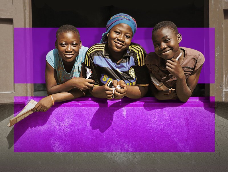
Born as a small and mighty group of volunteers in the Hudson Valley, For the Many has grown into one of the most essential and fastest-growing political grassroots organizations in New York. They have a proven track record of winning laws and elections that create lasting change for everyday people in their state. They played a crucial role in winning $2.1 billion for undocumented workers not included in federal stimulus and unemployment benefits during the pandemic. They won Municipal ID programs in over seven cities across New York State, registered thousands of voters, and continue to win statewide legislation and local campaigns, making life better for their neighbors. As their organizing and activism continue to evolve, their brand failed to reflect that and held them back from reaching new people, limiting them to the Hudson Valley region.


How do we rebrand a political grassroots organization to clearly communicate what they stand for?
They needed a brand new name and identity that positioned them clearly on its own but could also stretch and be campaignable. We began our partnership by developing an entirely new brand from the ground up. We conducted stakeholder interviews with their active members, staff, and leadership team. This kickstarted our naming process, built on the core essence, values, purpose statement, elevator pitch, and name and tagline.
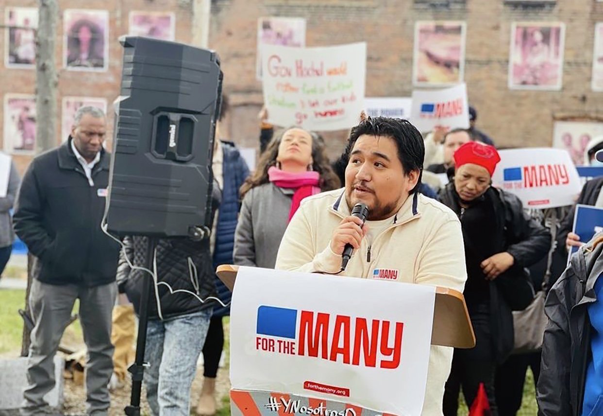
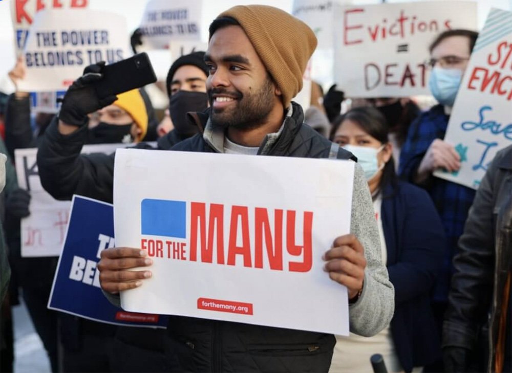
A unifying theme that stood out to us was People Power. It was clear from the start they were a dedicated team of people who cared deeply about the work they do and came together across race and age to grab power back from the greedy few. It was critical that our work also connected them with their Spanish-speaking members, translating seamlessly. This led us to develop their name ‘For the Many’ paired with the tagline ‘The power belongs to us”.


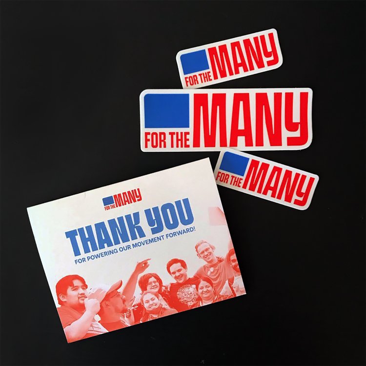
Reclaiming power for the many is baked into every aspect of the identity.
We harnessed the American flag and developed the Union shape, which is pulled as a graphic device across their communications, from websites to branded training tools and decks. We extracted graphic applications from the typeface itself, creating a bold and unified pattern that aligns elements behind selected and treated photography. The typeface we selected sits on the same baseline and stands proudly with different counter heights, carrying plenty of personality and character. We knew the brand, colors, and family of fonts needed to capture the urgency and grit of the critical issues they’re fighting for and be seen clearly across all communications, from digital platforms to banners at rallies and inside city halls.


Developing a site built for action.
We harnessed the American flag and developed the Union shape, which is pulled as a graphic device across their communications, from websites to branded training tools and decks. We extracted graphic applications from the typeface itself, creating a bold and unified pattern that aligns elements behind selected and treated photography. The typeface we selected sits on the same baseline and stands proudly with different counter heights, carrying plenty of personality and character. We knew the brand, colors, and family of fonts needed to capture the urgency and grit of the critical issues they’re fighting for and be seen clearly across all communications, from digital platforms to banners at rallies and inside city halls.


What we delivered.
-
Brand Strategy
Research & analysisCore essence
Vision
Mission
Personality
Tone of voice
Brand architecture
-
Brand Voice
Elevator pitchBrand promise
Tagline
Key messages
-
Brand Identity
LogoProgram logo
Family of fonts
Color palette
Copy style
Photography style
Brand book
-
Brand Experience
Brand launch campaignSocial media profiles
Keynote
Brochure
Office branding
Workshops & training


Sparking conversations.
Making the brands we work on more inclusive.


185%
Foundation fundraising increase since the launch of their rebrand.


“They interviewed our team, several of our members, and reviewed many of our written materials. Once they felt like they had a good grasp of what our brand was, they worked with us to build an entirely new brand from the ground up. That included our core essence, purpose statement, values, value propositions, name, logo, tagline, colors, fonts, an entirely new website, and marketing materials. And probably more I’m forgetting. We needed a lot. They deliver high-quality work from the biggest picture strategy to the most minute details of design and content.”
— Jonathan Bix, Executive Director

23%
Increase in contacts who have taken action from 2021 to 2023.
See related work.
-

Building political power.
-
Champions for gender equality.
-

A force for social good.
