GRAND ROUNDS HEALTH
CARE SHAPED AROUND YOU.
Grand Rounds Health is doing healthcare differently. As an employee benefits company, they understand more than anyone that managing your health is complicated, frustrating, and stressful. It's exactly why they started their company in the first place so that they can change it. They've flipped the healthcare model on its head, making the entire experience about what's best for their members, not insurance companies. And they're doing it for over 6 million Americans from coast to coast.
The problem was that their brand lacked the personality it needed to get their clients' employees to sign up for their health benefits. So we started with a top to bottom communications audit to identify what pieces of their brand needed shoring up.


Putting the patient at the center of the brand.
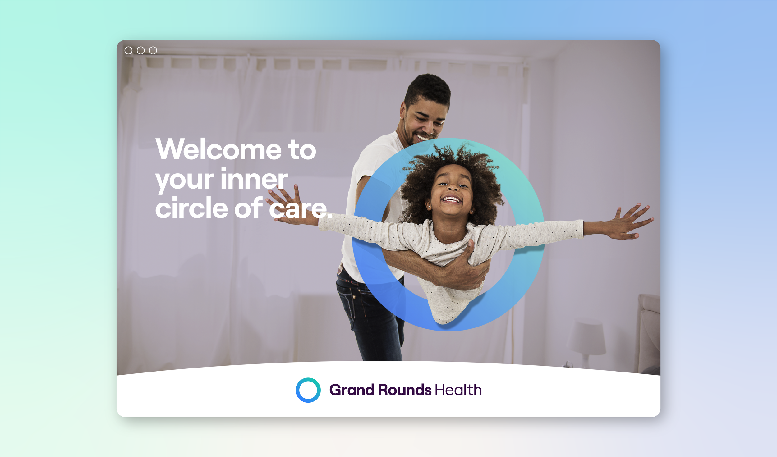
After a complete repositioning, we developed their new tagline, 'Care shaped around you,' which played into their origin story about care teams built around each person's individual health needs. But the tagline also helps to connect their name visually, so it supports their name, and their name supports the tagline. Simple.
Even though their name wasn't changing, we wanted it to be more relevant and memorable, especially in such a highly competitive sector. That led us to create a circle icon that flexes across every touchpoint from their website, newsletters, email marketing campaigns, and social media.
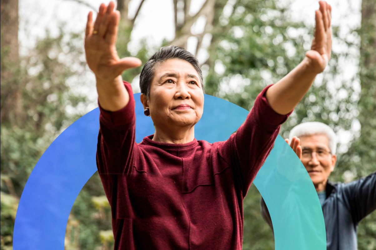
We then developed a rich photo library of branded images, integrating the circle icon, that shows the diversity of their customers in realistic lifestyle situations instead of projecting an out-of-reach utopian and glossy image.


Reaching millions more people has been a grand result.
We also worked closely with the B2B, B2C, and product teams to create a series of value propositions to help upsell employee engagement. And because we'd already redefined their tone of voice, we knew exactly how to craft each one to be concise and on point.
We targeted the new brand for the end-user rather than the buyers to create a 'build it, and they will come' strategy. And it worked. The rebrand has given them a significant uplift in the user engagement they set out to get. They can now be an even bigger force in healthcare because they'll be able to reach millions of more people to make them healthier and happier. And well, we think that's pretty grand.


“Because they’re a smaller agency, you truly feel like your project is the biggest thing in their world. They give the type of care and communication that customers need. Our project means everything to us. With other agencies, it felt that they wanted the work for the check. But with Good Stuff Partners, I felt that they were truly invested, even to the level that they were invested in our mission and to us as a company in healthcare.”
— Jim Deeken, Senior Director, Creative Services
What we delivered.
-
Brand Strategy
Research & analysis
Core essence
Differentiators
Personality
Tone of voice
Brand architecture
-
Brand Voice
Elevator pitch
Descriptor
Tagline
Value propositions
-
Brand Identity
Logo
Family of fonts
Color palette
Photography style
Iconography
-
Brand Experience
Website
Newsletter messaging
See related work.
-

Help Me Grow Marin County
-

Vibrant
-

YMCA