
Modernizing foster care.
PIVOTAL
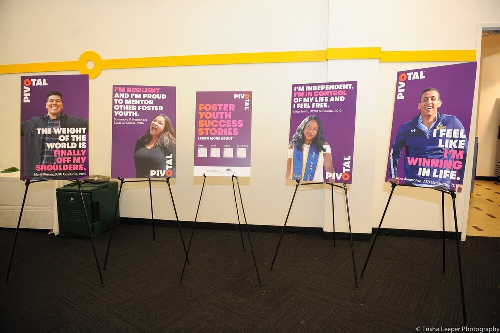
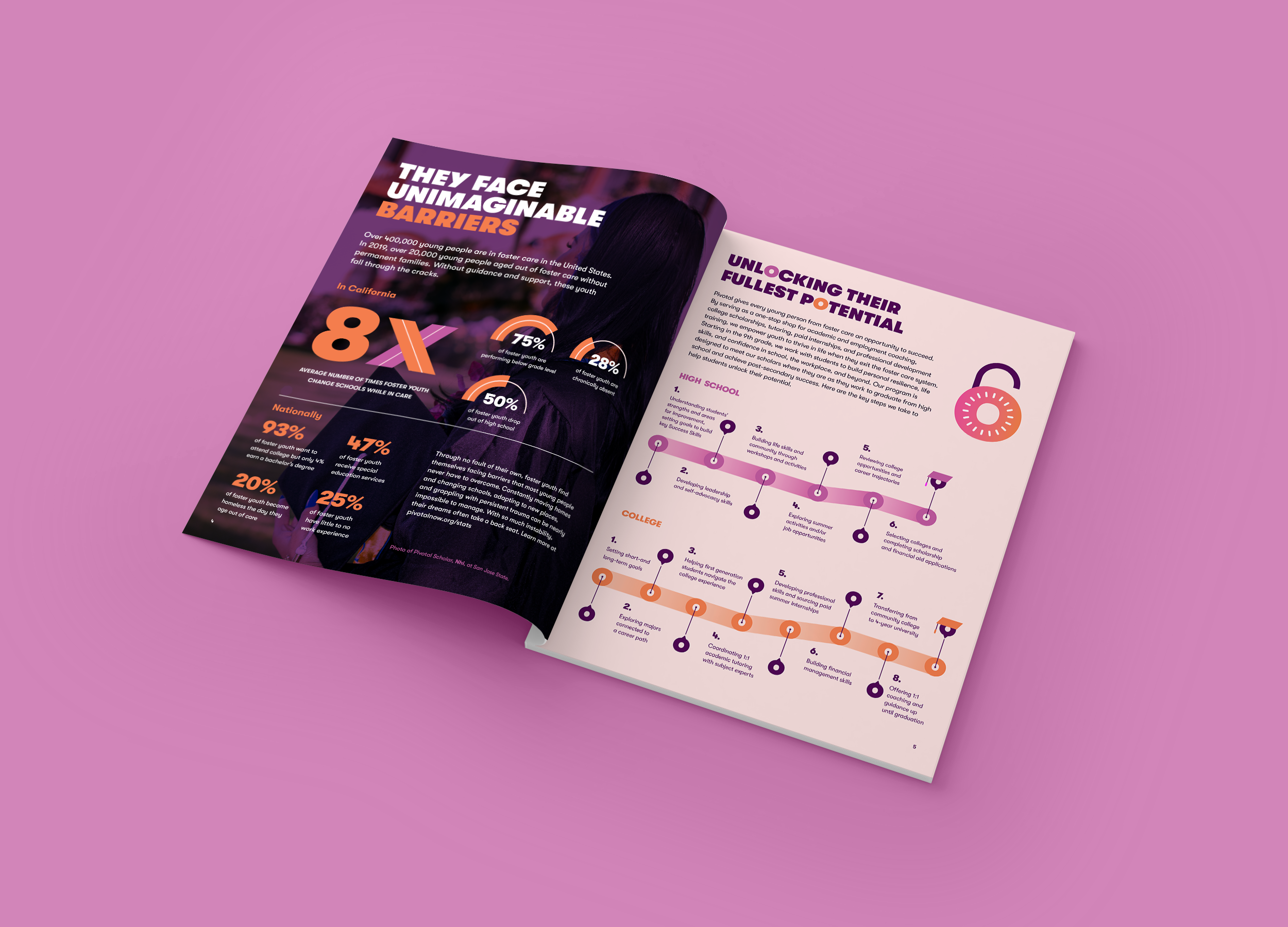
Silicon Valley Children’s Fund supports young people in foster care, who through no fault of their own, find themselves in very challenging circumstances, often homeless and unable to complete high school, let alone go onto college. Over the last five years, Silicon Valley Children’s Fund had grown significantly. They had also recently merged with Teenforce, expanding their services into employment as well as education. Their name, brand and communications no longer reflected who they were, or connected with the young people they work with.


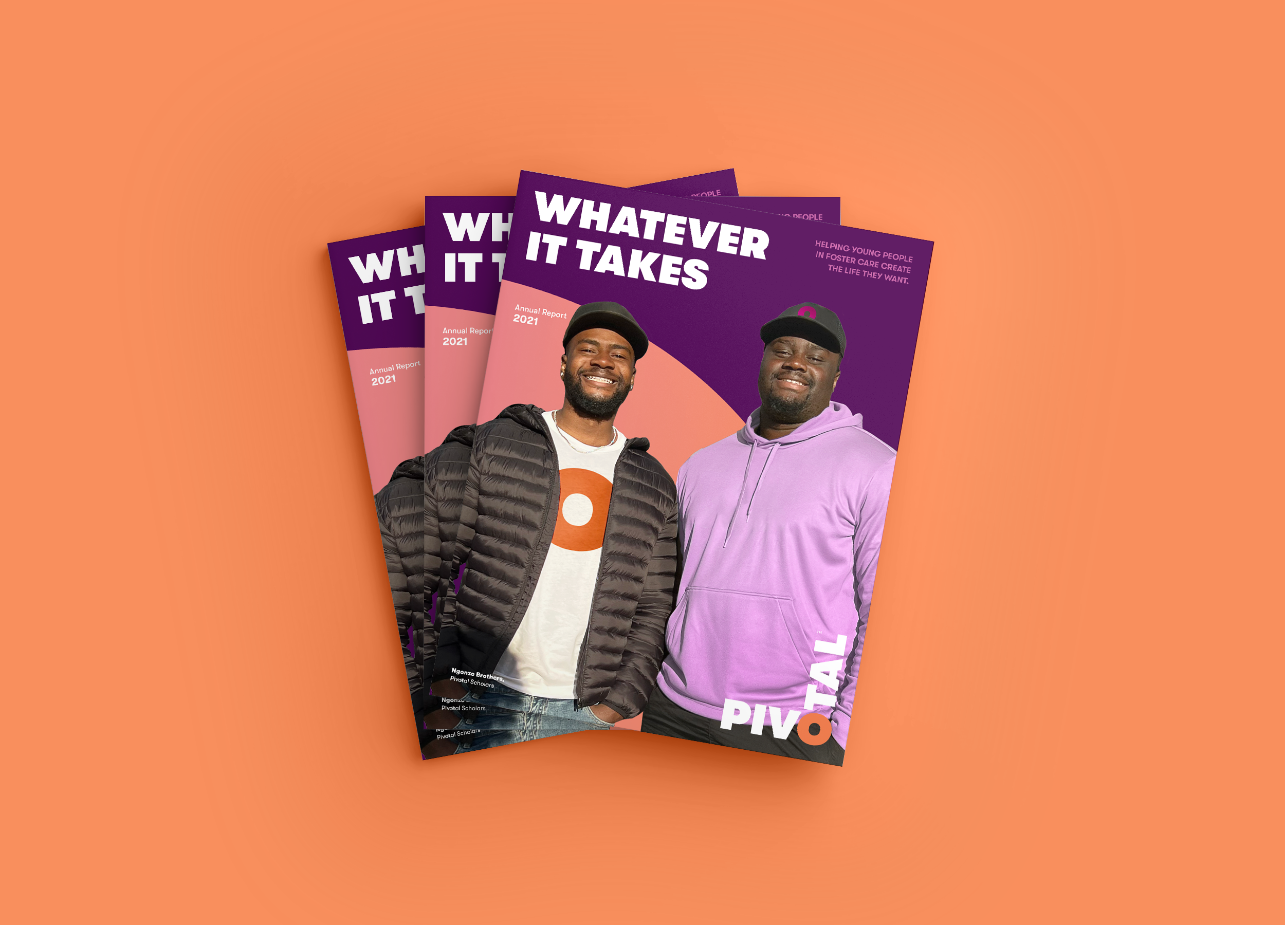
A new name and brand to help them reach more young people in foster care.
We worked with their board, leadership team and the young people they help. We renamed them Pivotal to reflect the fact that they work with foster youth during the critical years of high school, college and first jobs. The years that really shape their life opportunities. We developed a simple descriptor and powerful tagline to give clarity to what they do, who they do it for and most importantly why their approach is different.
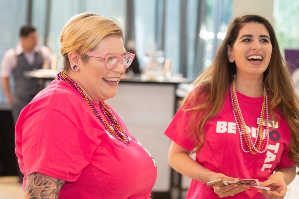
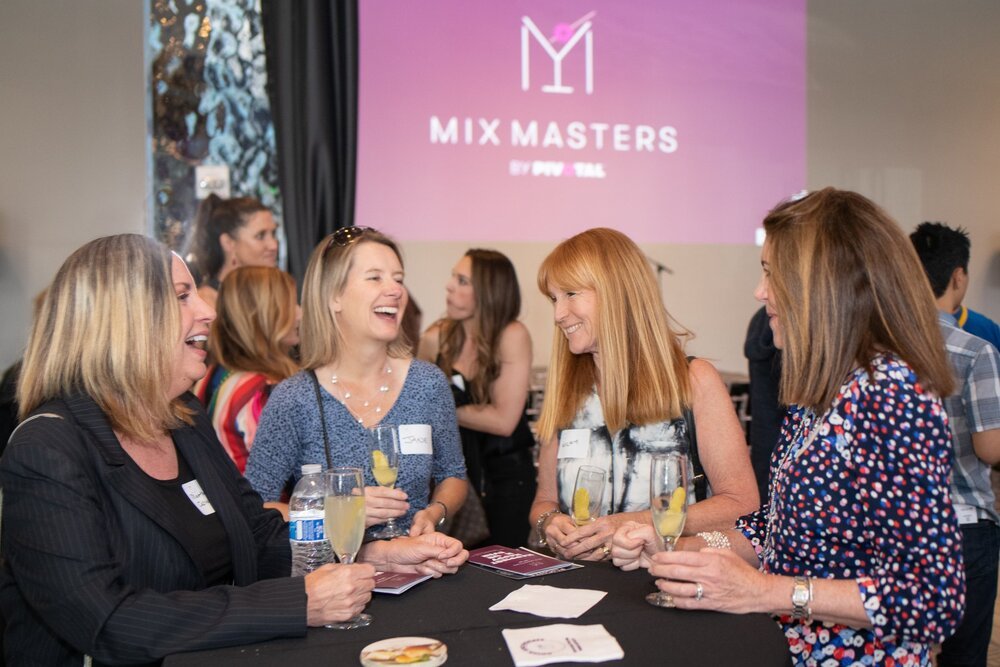
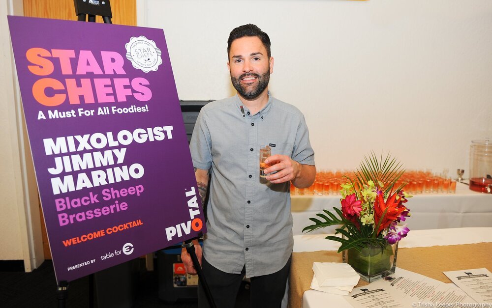
We gave them a much simpler, more authentic voice and identity. The brand they have now is much more campaignable across all media and lends itself to highly targeted communications. We’ve created all the digital and print assets so every touchpoint is consistent and brings their personality to life. As their agency of record, we’re working with them every step of way, developing their communication strategy and plan, so they can grow and ultimately provide equal opportunities to every single young person in foster care across Silicon Valley.


A pivotal name change.
We started by rebuilding their brand communications from the ground up. We worked with their board, leadership team, and the young people they help. We renamed them Pivotal to reflect that they work with foster youth during the critical years of high school, college, and first jobs. The years that really shape their life opportunities. We developed a simple descriptor and powerful tagline to clarify what they do, who they do it for, and most importantly, why their approach is different.


Sub-branded logos


Developing a site built for community awareness and fundraising.
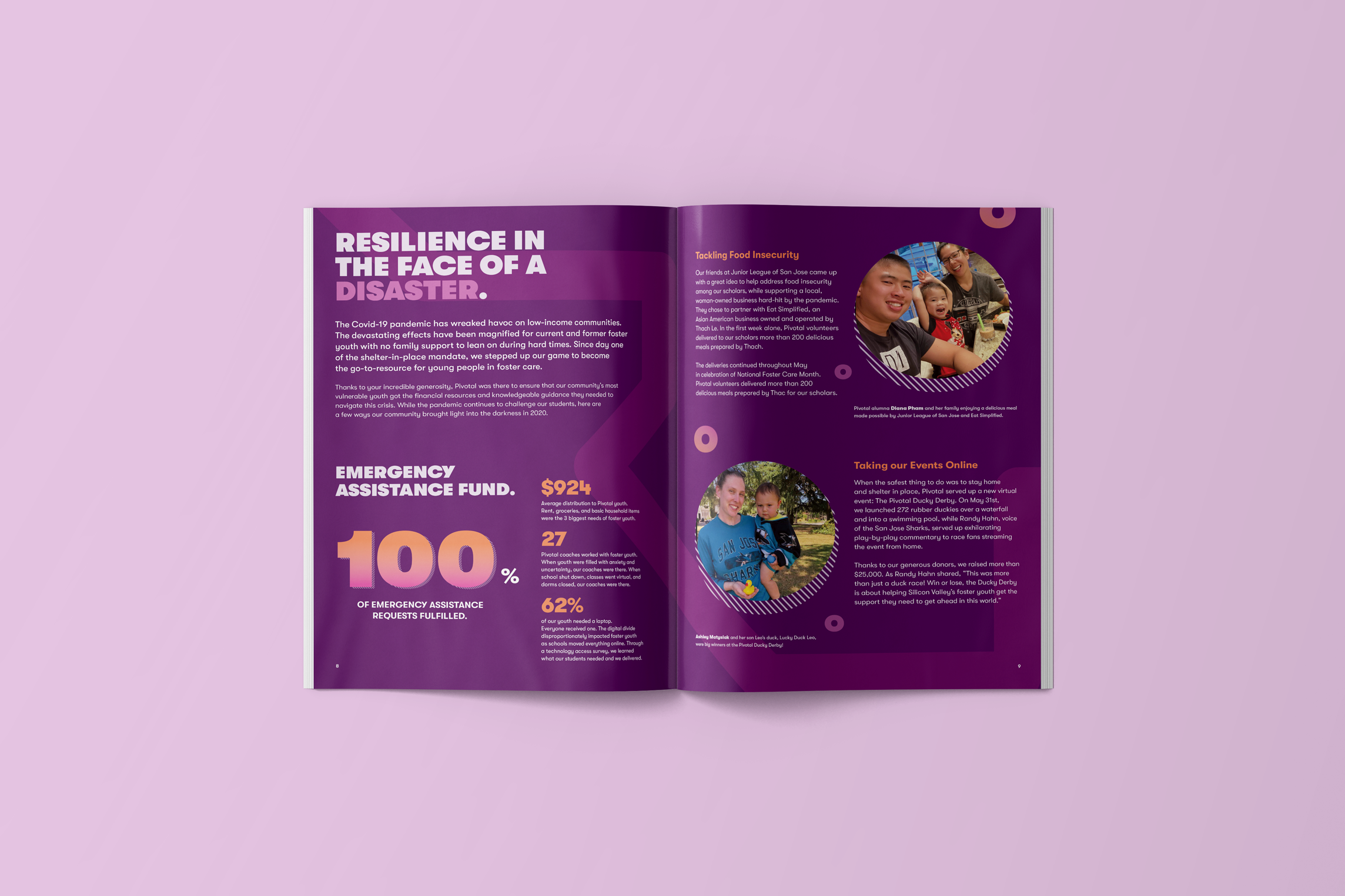
Their old site lacked a depth of information about who the organization was. They were also moving into a new direction, trying to expand their audiences across the Bay Area to create a movement and become leaders in their sector. The general public lacks awareness about the experience of living in the foster care system so the website was a tool to communicate those challenges in order to gain more followers and grow their support. It was also a resource for young people in foster care, helping them connect with Pivotal for education and employment opportunities. Finally, the site tells its story and impact so succinctly that big donors offer unsolicited donations. In the past, that only happened through events and relationship-building.

Website developed by Sam Pohlenz


What we delivered.
-
Brand Strategy
Research & analysisVision
Mission
Personality
Tone of Voice
Brand Architecture
-
Brand Voice
Elevator pitchBrand promise
Descriptor
Key messages
-
Brand Identity
LogoFamily of fonts
Color palette
Copy style
Photography style
Icons
Event logos
Brand book
Sub-brand Logos
-
Brand Experience
Brand launch campaignSocial media profiles
Proposals & reports
Newsletter
Keynote
Brochure
Stationery
Promotional material
Architectural signage
Workshops & training
Event branding
SEO / Analytics


Sparking coversations.
Why SEO is not your digital strategy.


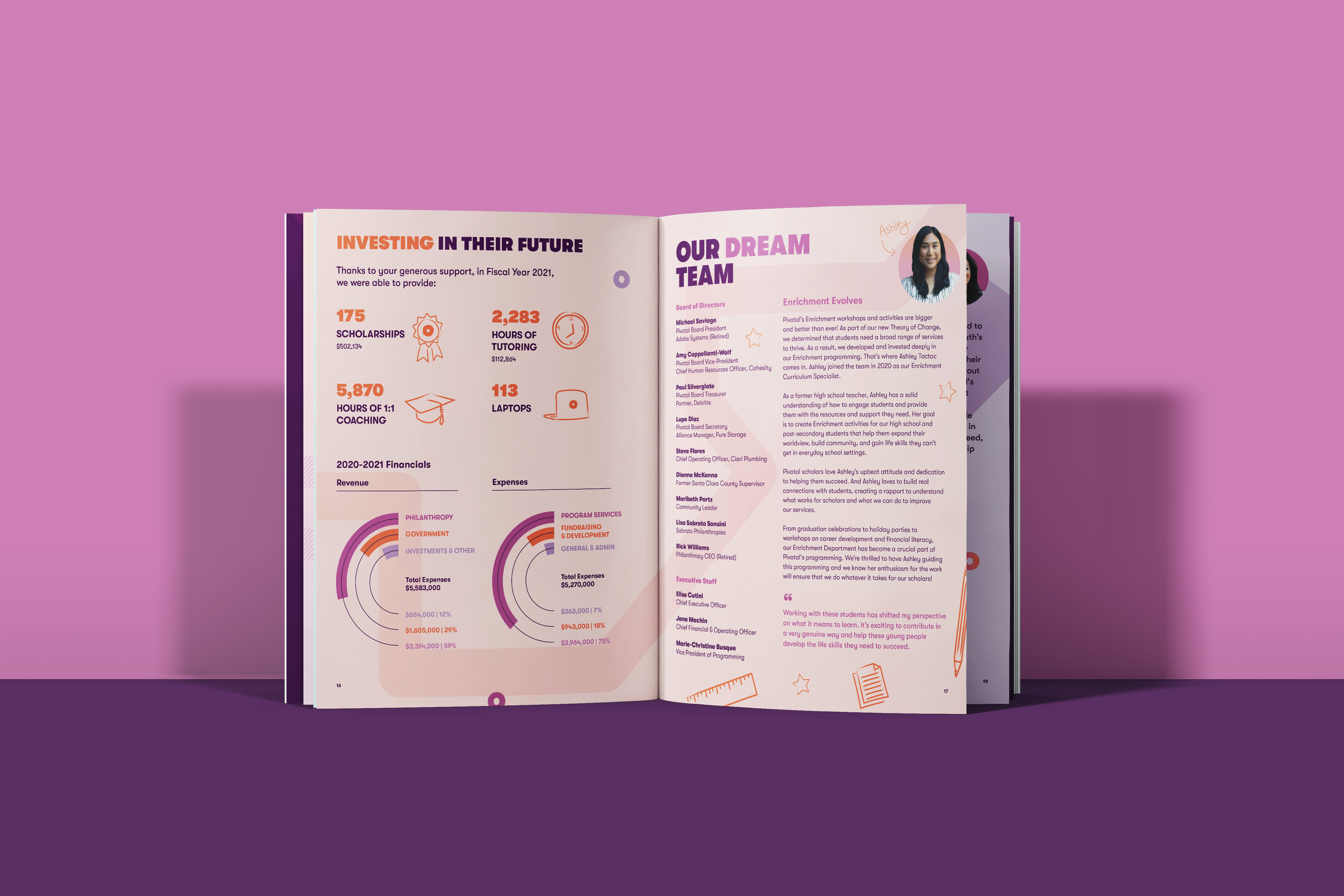
$750K donated in 2021
Pivotal received $750,000 in unsolicited donations, including $250,000 from Jack Dorsey’s #StartSmall philanthropic initiative.

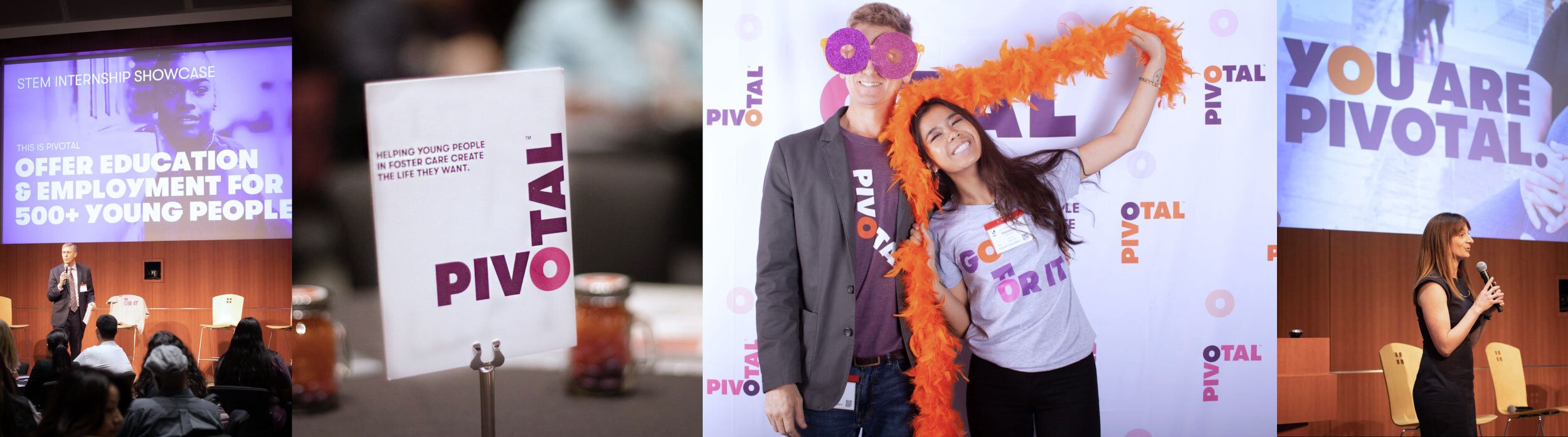
“Re-branding to Pivotal has given us traction in so many ways. One of the coolest outcomes has been with the youth we serve – I’ve seen our youth excited about our brand…it’s something they’re proud to be a part of…which means so much. And with the new look and feel of our organization, we’re creating a buzz in the community, developing new relationships, and talking about what we do in a way that’s exciting, innovative, and true to who we are.”
— Elise Cutini, CEO
See related work.
-

Building families a future since 1989.
-

A Marin County for all.
-

Stronger communication, stronger community.
