NORTH MARIN COMMUNITY SERVICES
STRONGER COMMUNICATION, STRONGER COMMUNITY.

Since 1972, North Marin Community Services has helped people all across the North Bay to have a better quality of life, no matter how much money they make or where they were born. They believe until everyone has access to the same opportunities, our county will never be as strong as it should be.
They're on a mission to tackle Marin's extreme income, racial and educational inequalities. Through their food, money, childcare, education, and health programs, they're able to address the very real disparities for over 8,000 people a year.


Building stronger digital touchpoints after a merger.
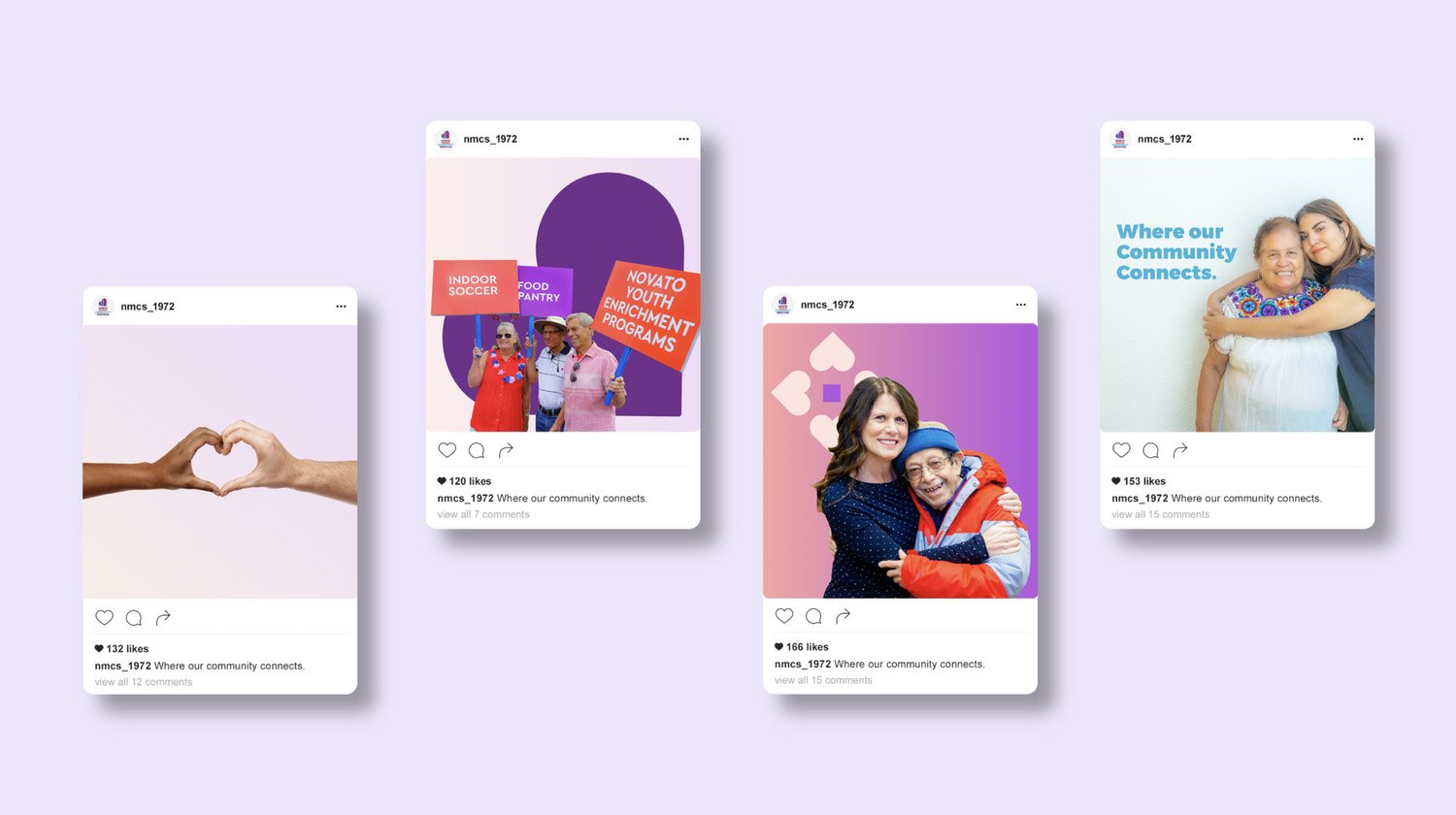
North Marin Community Services had just developed their identity and gone through a merger, so they needed a design and branding agency to help them build their digital touchpoints. That's where we stepped in. We worked side-by-side with their leadership team to find their communication roadblocks, starting with a full audit of their website, social media, and newsletters. After restructuring their content and site architecture, we wrote new key messaging and then got to work updating their look and feel and rolling it out across every channel.


Welcoming designs that
respect and reflect their Latinx audience.
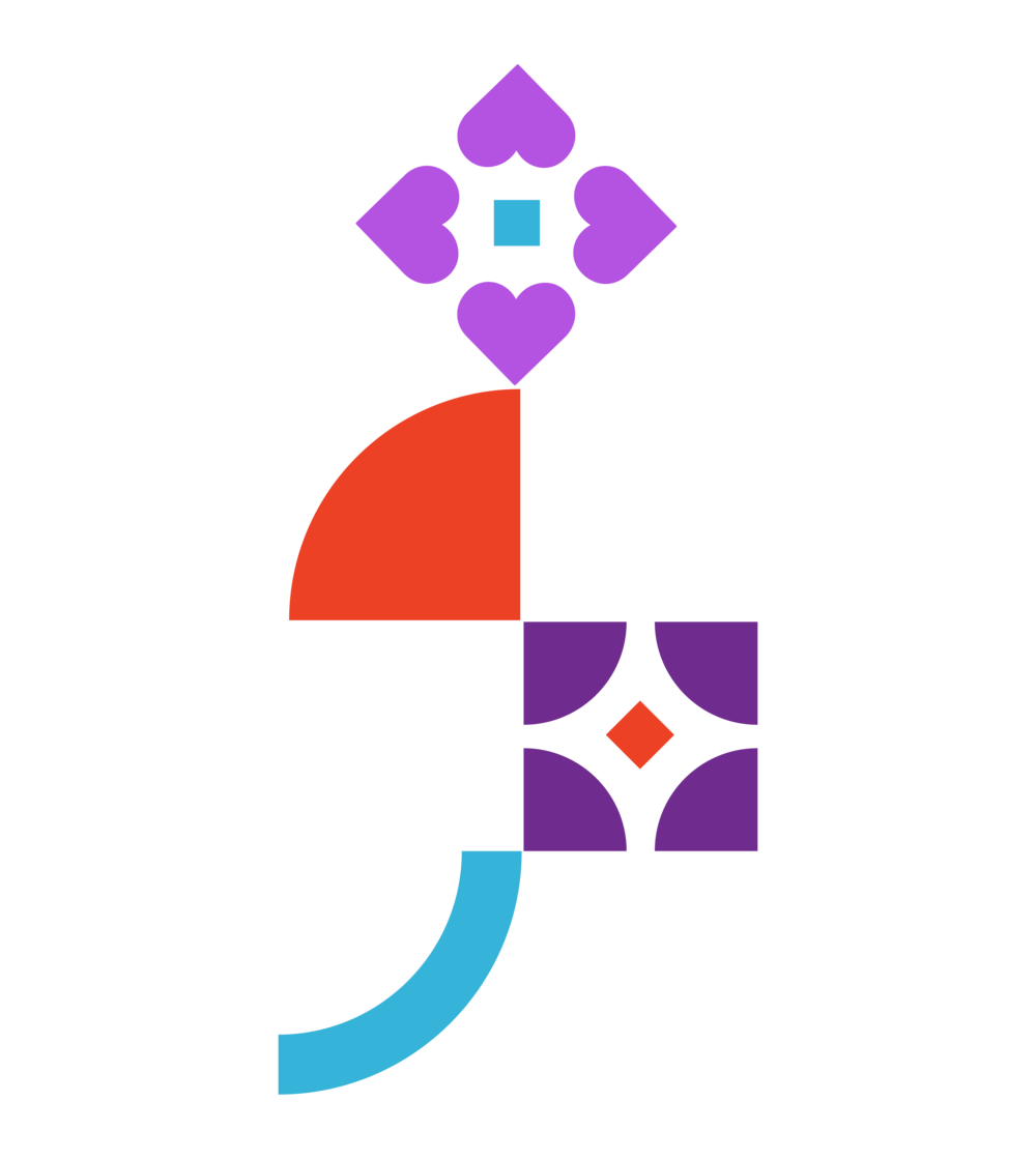
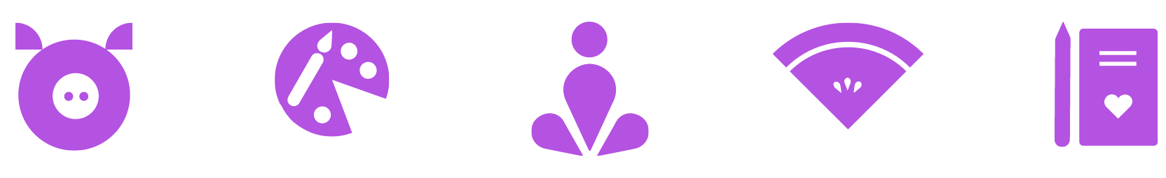
It was important that the design reflected Hispanic culture since the majority of the population they serve are from Mexico and Central America. We developed colorful shapes that compliment the logo and had a nod to papel picado, the decorative craft of cutting elaborate designs into sheets of tissue paper. Creating simple icons to represent each service category also makes it easy for anyone to understand, regardless of their native language.
Now, their new design not only feels friendly and familiar, but helps their audiences easily navigate to the services they need and discover other services they didn't know were available to them. We also made the entire experience as simple as possible to alleviate an already stressful time. Their staff has more energy in their work, and donors and partners can now understand the true impact on the people in their community.


Read the blog.
Making the brands we work on more inclusive.


What we delivered.
-
Brand Strategy
Research & analysis
Personality
Tone of Voice
Website Architecture
-
Brand Voice
Elevator pitch
Descriptor
-
Brand Identity
Logo
Family of fonts
Color palette
Photography style
-
Brand Experience
Website
Social media
See related work.
-

Habitat for Humanity Greater San Francisco
-

Community Action Marin
-

Magnify