ALL HANDS ECOLOGY
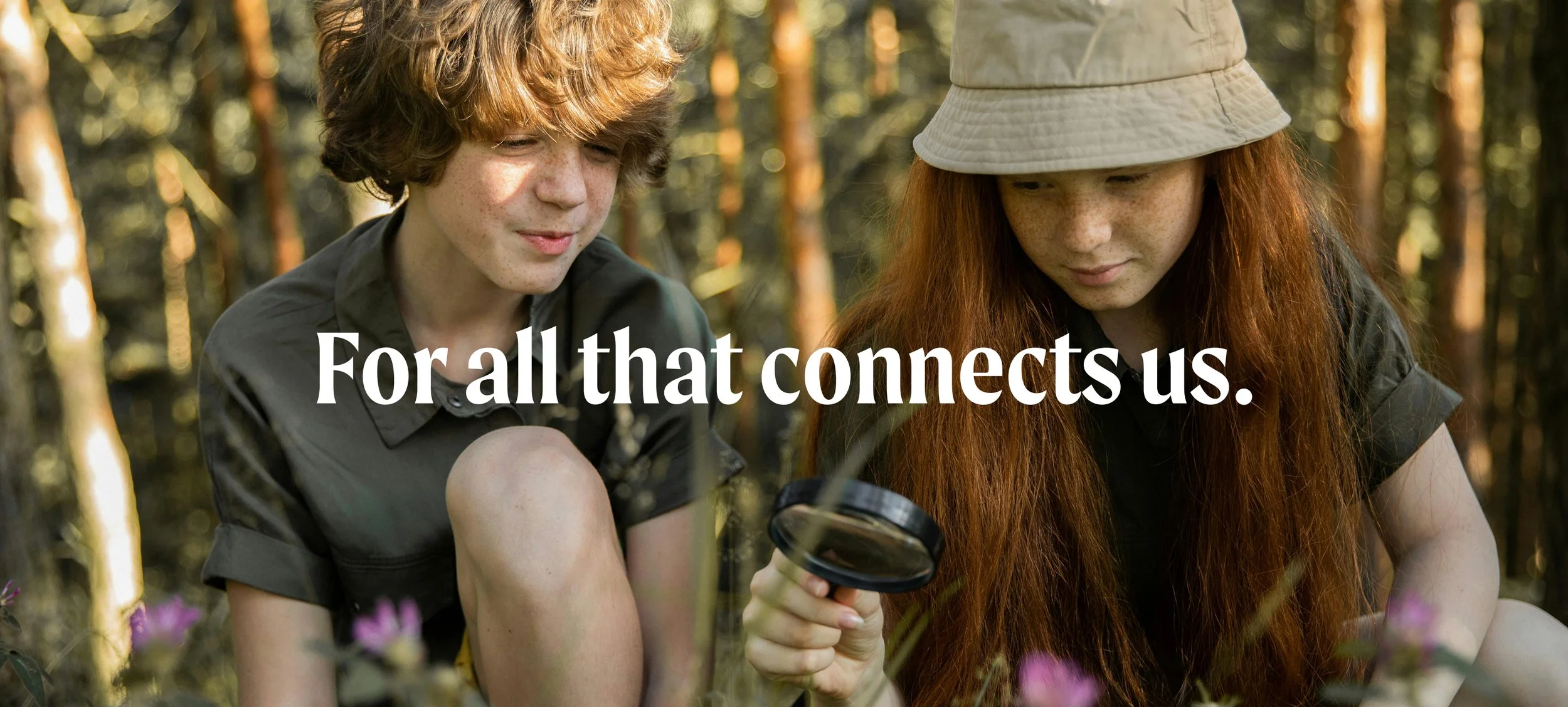
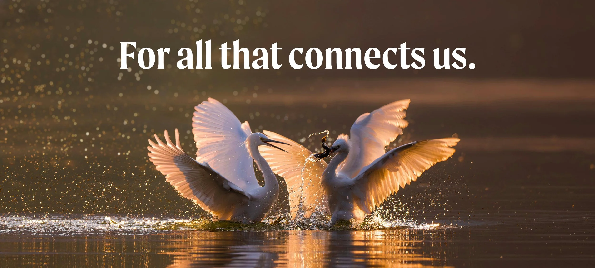
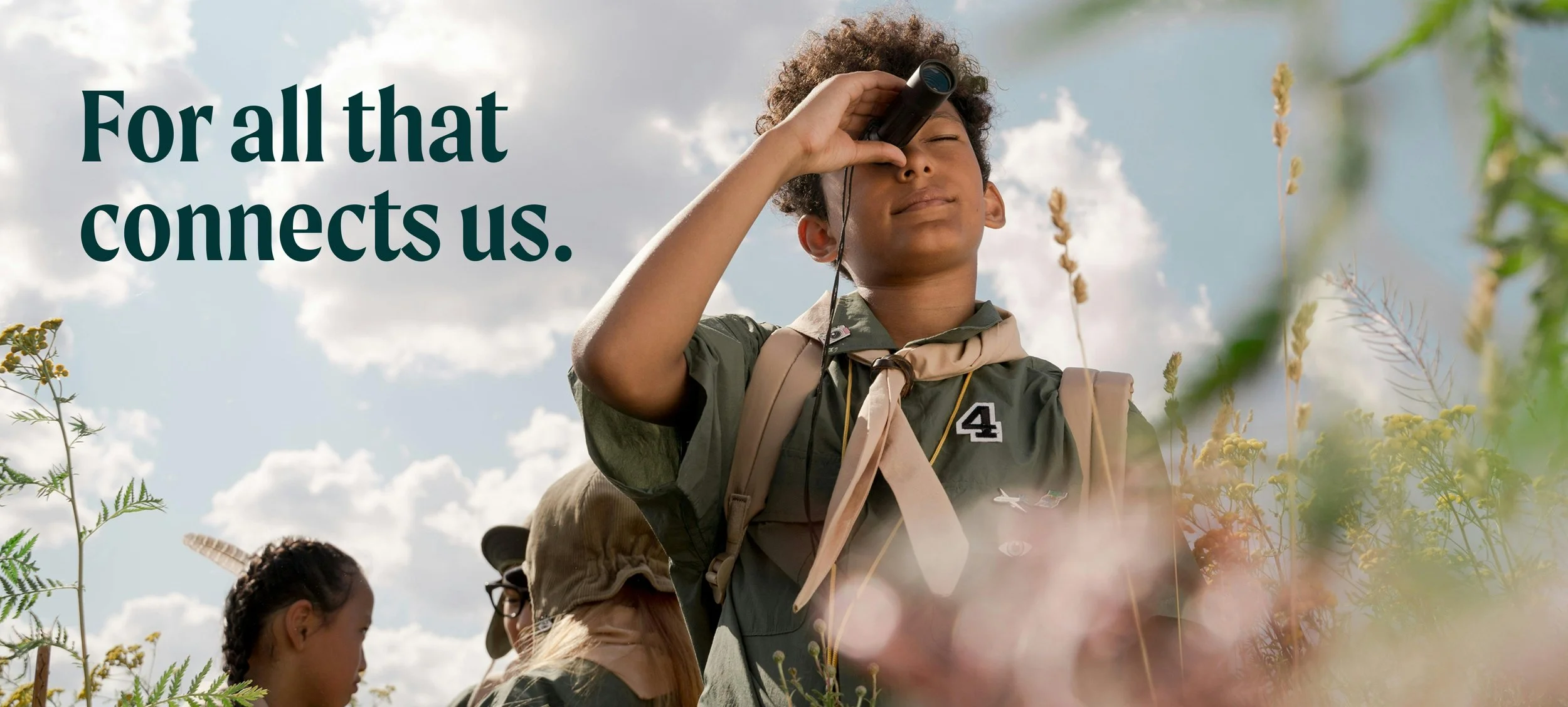
FOR ALL THAT CONNECTS US.
After 60 years, Audubon Canyon Ranch was evolving and ready to write its next chapter. With a new strategic plan, a refreshed website, and a new name in hand, they needed a brand that could bring it all together—one that honored their legacy, united their vision, and inspired new audiences.

We began by getting to know their organization and the team behind it. Their mission of connecting nature, people, and science for a more resilient world was clear, but their warmth, openness, and curiosity weren’t showing up in the brand. We wanted to differentiate them by avoiding botanical illustrations common in environmental branding. The logo needed to embody their all-encompassing approach to people and ecosystems. We needed to think bigger.
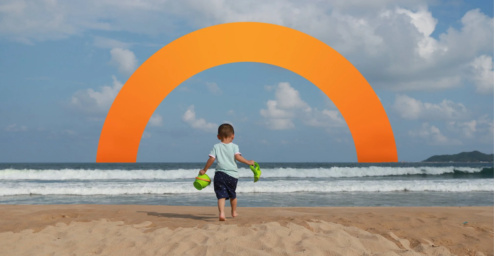
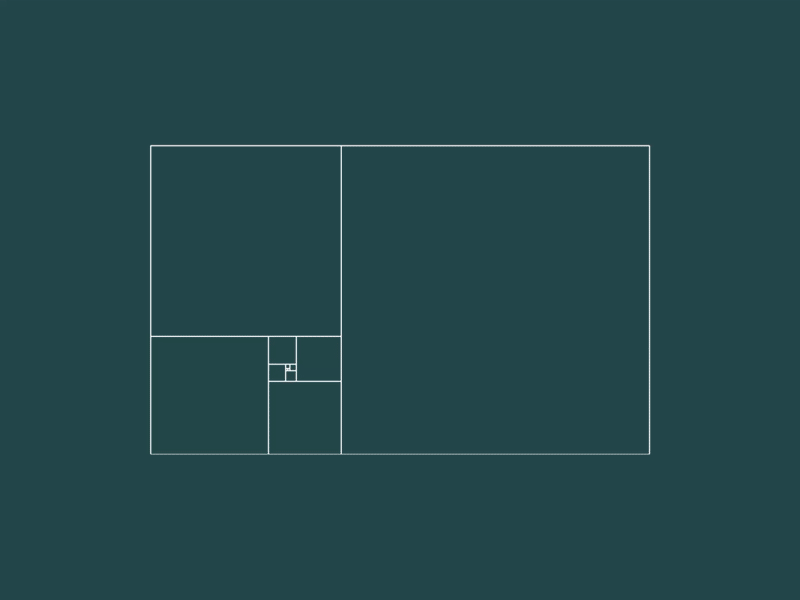
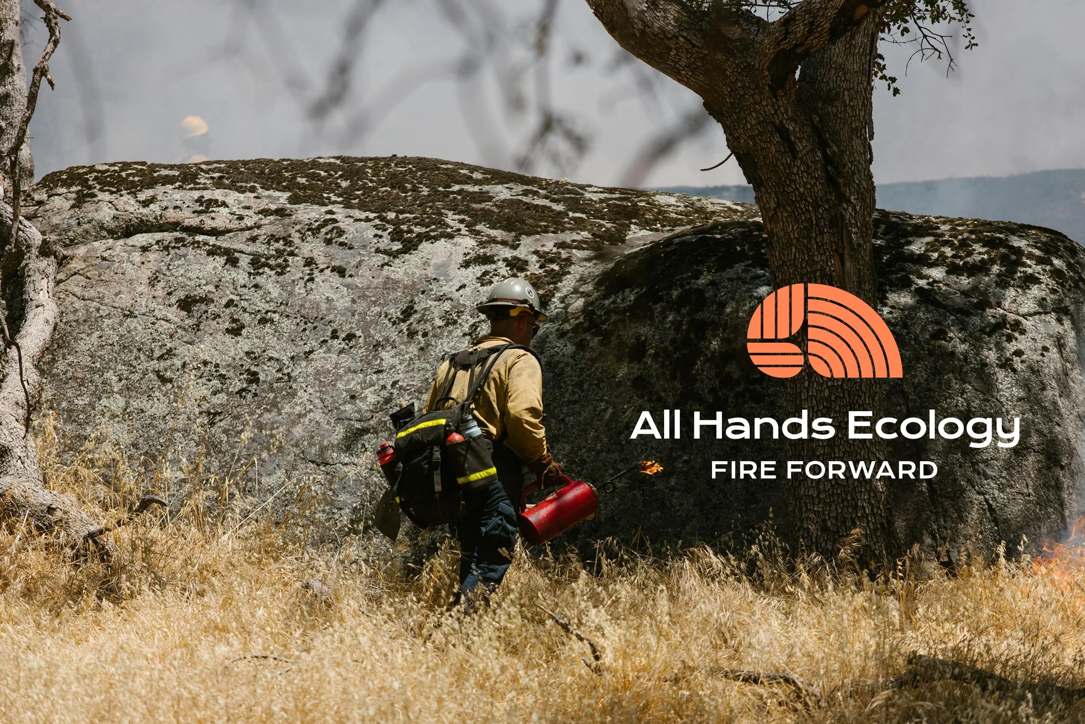
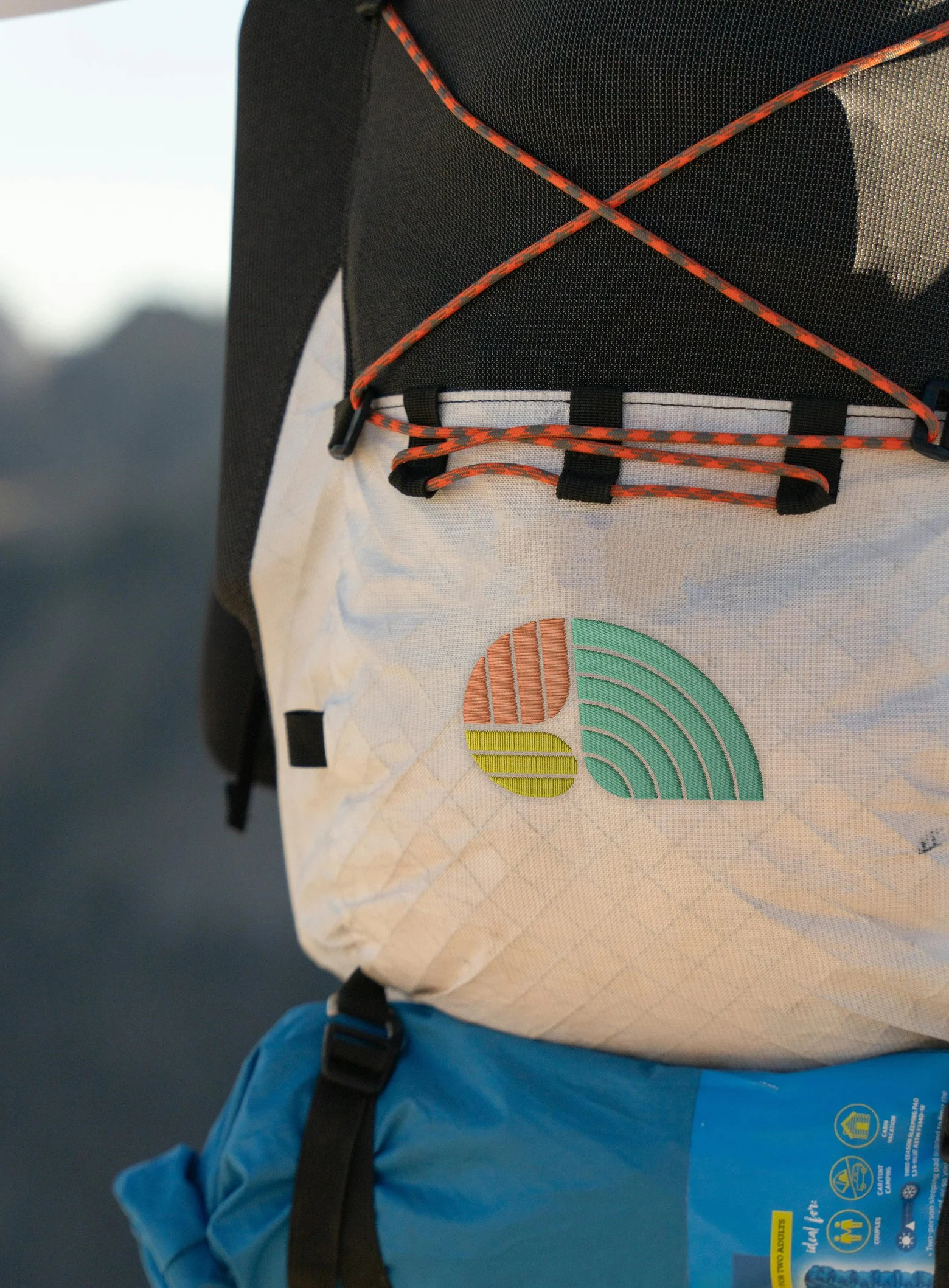
Their new name—All Hands Ecology—drew us to the concept of the classic Fibonacci spiral, which is unifying and inclusive in its ever-present nature.
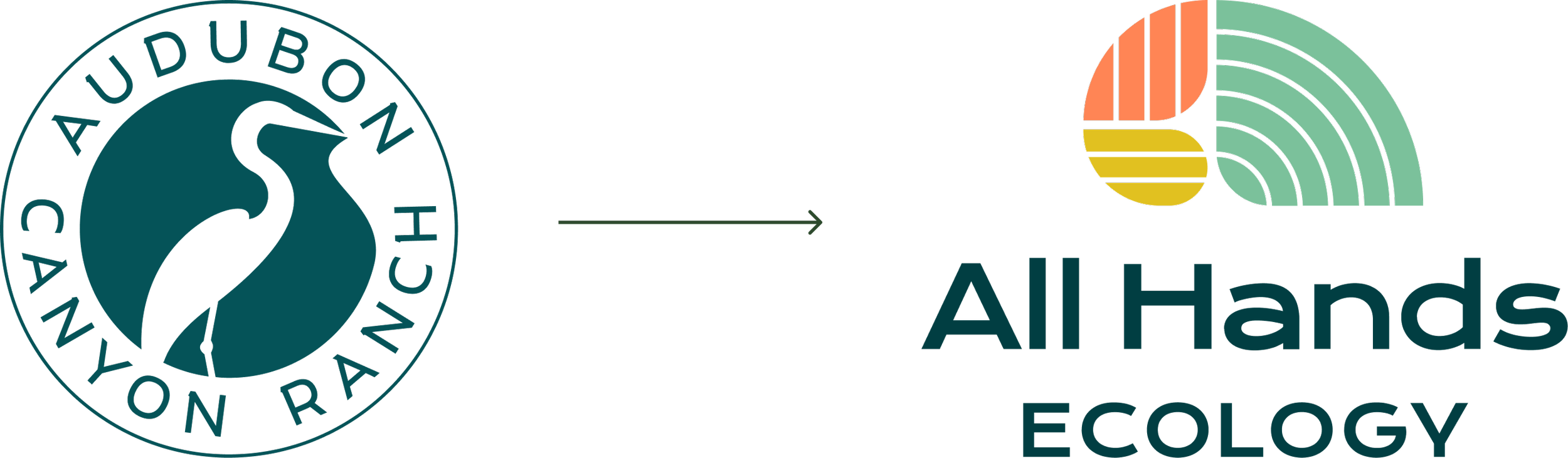
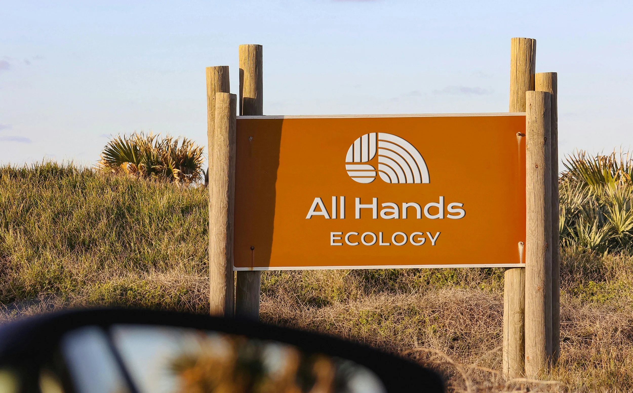
The new logo captures the balance and harmony at the heart of their work, using the infinite nature of the Fibonacci spiral to echo their enduring commitment to the lands they love. The stripes illustrate the way their history and future are intertwined. Reinforced by the tagline “For all that connects us,” the identity makes their purpose unmistakable. It’s intentionally campaignable and ready to stretch across every corner of their work.
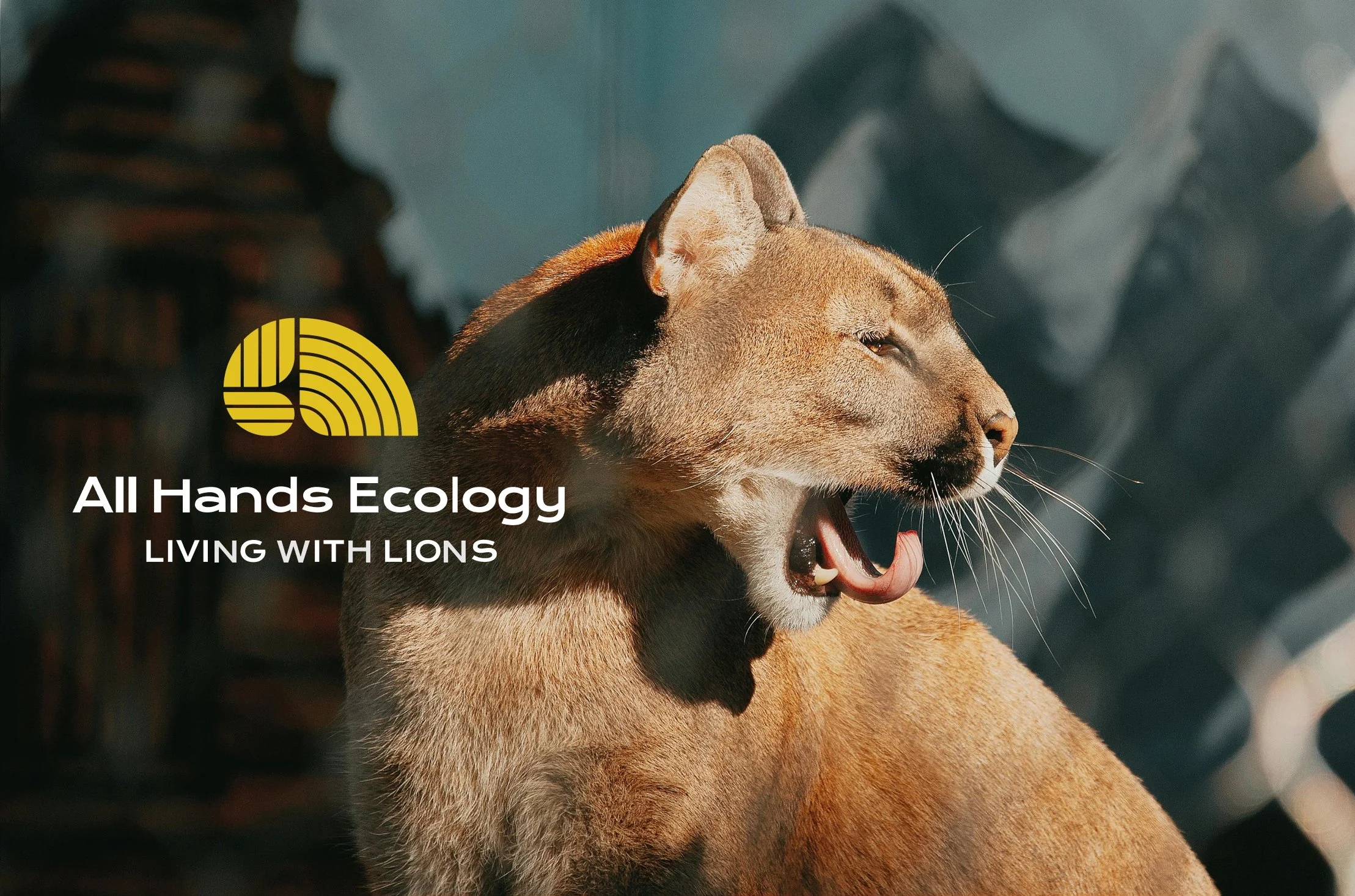
PROGRAM LOGOS
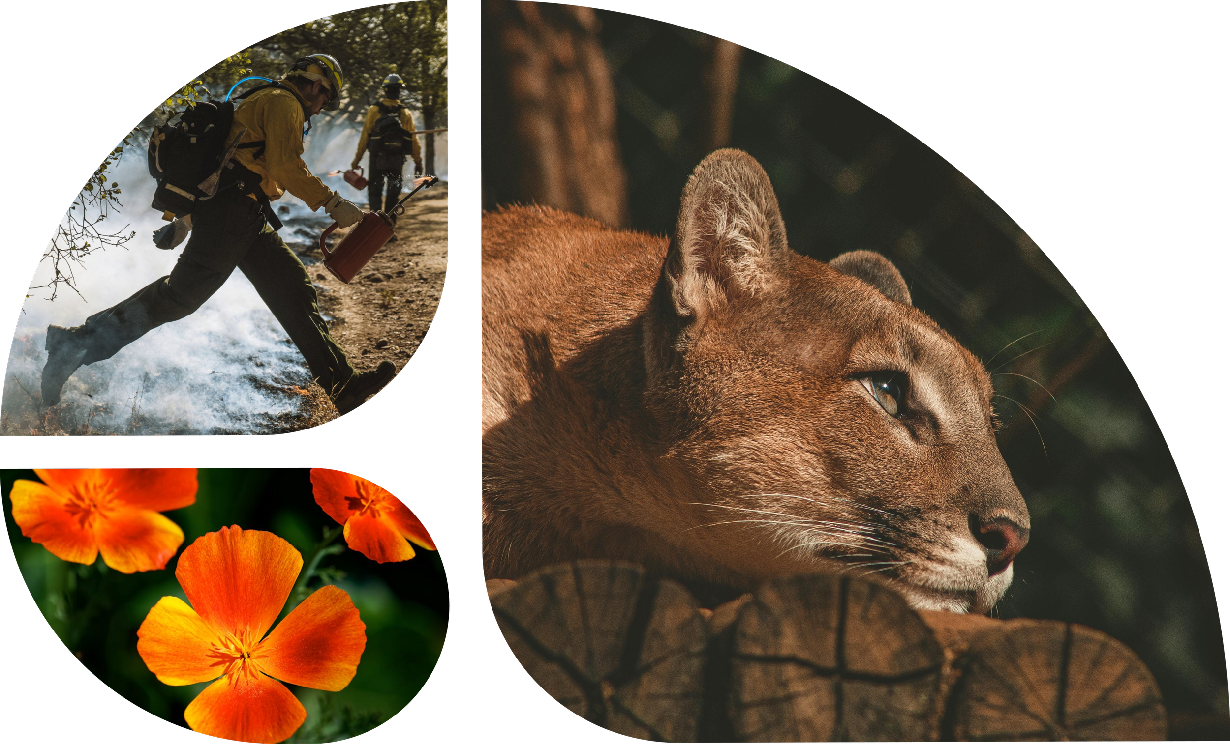
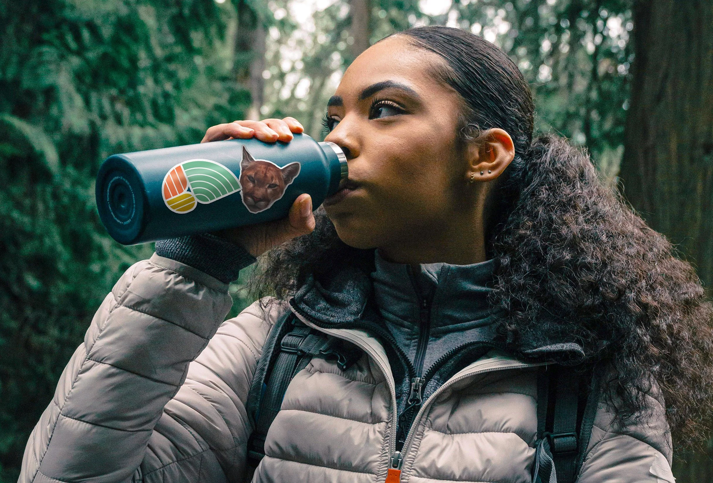
We developed sub-branded logos for their signature programs, ‘Living with Lions’ and ‘Fire Forward’. The solid colors distinguish the programs from the parent brand, but use the same icon and system to connect them under one umbrella.
Evolutions of Identity
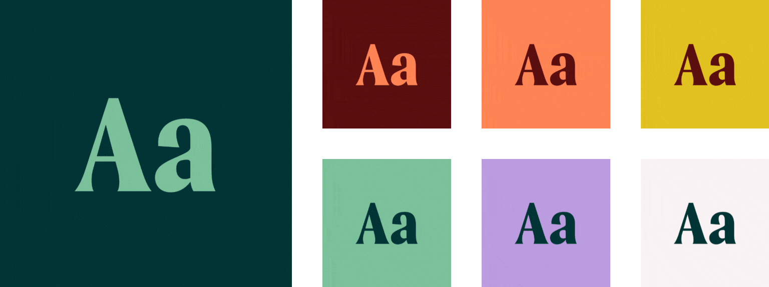
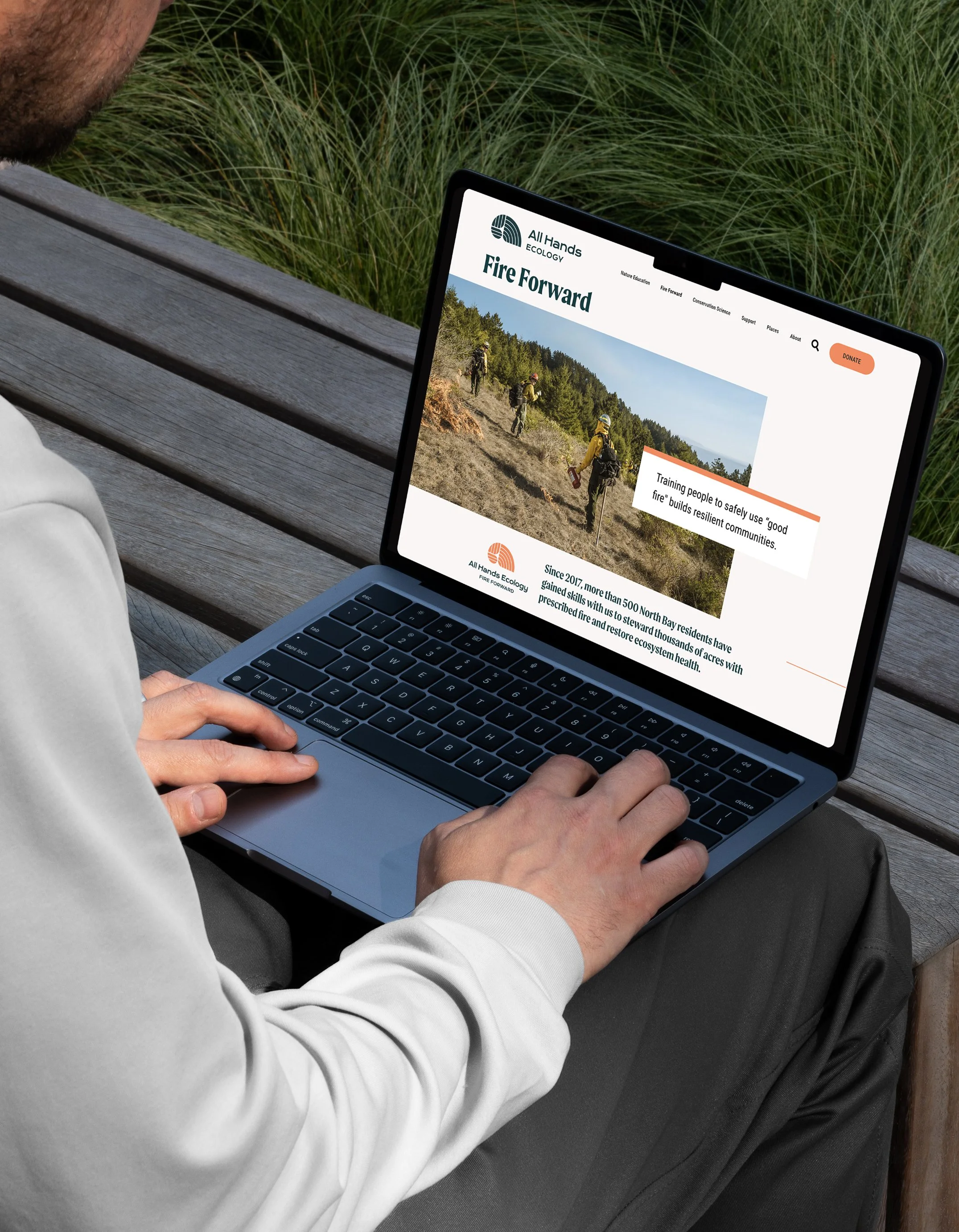
The client team had recently updated their website, so we did a light touch in applying the new identity — sourcing more modern and digitally friendly fonts and adding more color to create standout. Their expanded color palette gives them more flexibility across all other applications.
An Authentic Voice
Our writing captured their mission so authentically that the team had an emotional reaction. They could finally recognize themselves, their work, and their aspirations in the brand. By building around what they already had and amplifying their personality, we created a brand experience that’s welcoming, flexible, and distinctly theirs.

“We are so grateful for the Good Stuff partnership and getting to know many of you a bit. We have had really fantastic feedback from the identity and its story! Thank you.”
— Tom Gardali, CEO
WHAT WE DELIVERED.
Brand Identity
Logo
Program logos
Family of fonts
Color palette
Copy style
Photography style
Style sheet
Brand Strategy
Research & analysis
Core essence
Personality
Tone of voice
Brand architecture
Brand Voice
Tagline
Key messages