TIPPING POINT COMMUNITY
FIGHTING POVERTY IN THE BAY AREA.

Tipping Point Community is a prominent nonprofit dedicated to ending poverty in the Bay Area. 1.1 million of our neighbors don't have the resources to meet their basic needs. Since 2005, Tipping Point has invested nearly $350 million in housing, early childhood, education, and employment opportunities, helping to break the cycle of poverty. Connecting donors to grantees, Tipping Point helps to advance the most promising solutions so that everyone in the Bay Area can prosper.


How do we build a modernized brand system for a legacy logo mark.
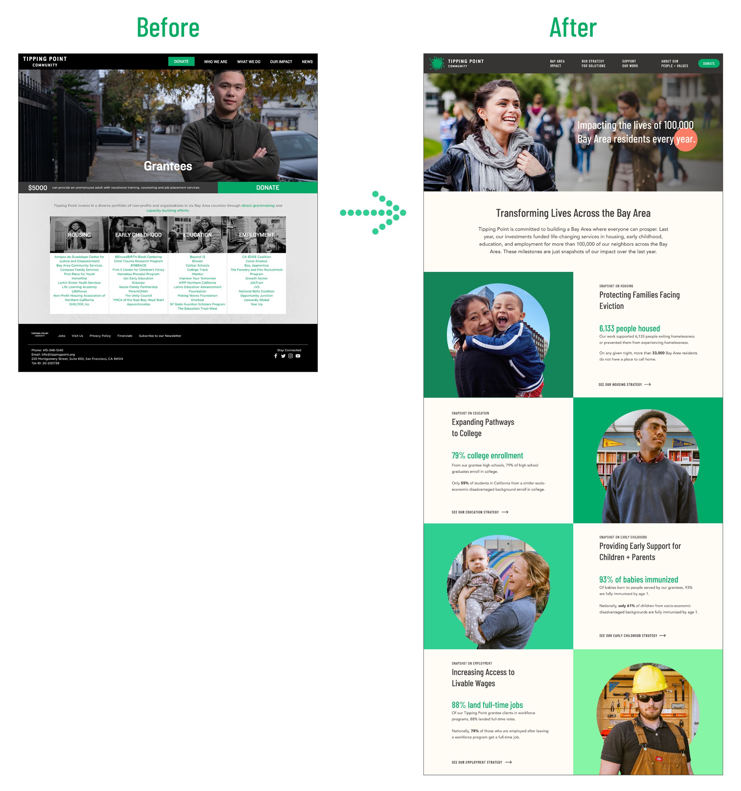
With over two decades of work building up a recognizable name for themselves, Tipping Point tasked us to redesign their website. Their goals were to drive interest and engagement with the larger Bay Area community and their donor base. We also saw this as an opportunity to bring a fresh and modern look to their brand through the website while staying connected to the identity familiar to their audiences.
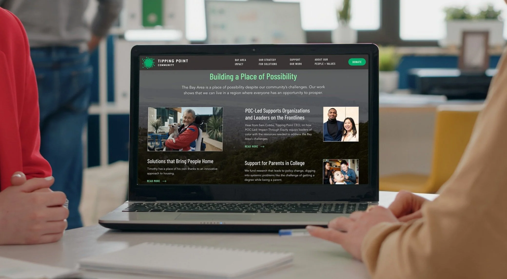
Their logo is a cluster of small green circles, representing individuals coming together to form a larger community. It's a simple but powerful icon that's a favorite with their team and something we needed to integrate into our new work seamlessly. Keeping their primary green and charcoal, we brought in supporting secondary colors; adding blues, oranges, and tones gave the brand a much softer and more optimistic feel while maintaining the strength and recognizability of their original green. Their team's need for more flexible brand assets drove this expanded color palette and selection of a more web-friendly font. Their current font, Knockout, had too many variables that felt intimidating, was too condensed, and wasn't compatible across their Google platforms. With usability in mind, we chose Barlow. This much friendlier Google font still had a condensed look with a limited number of variable weights that their team could implement easily across their new site and collateral.


Strategically developing a robust site to achieve their goals.
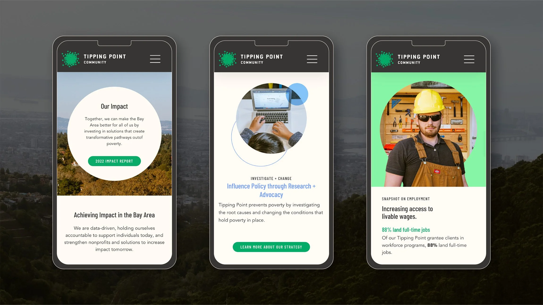
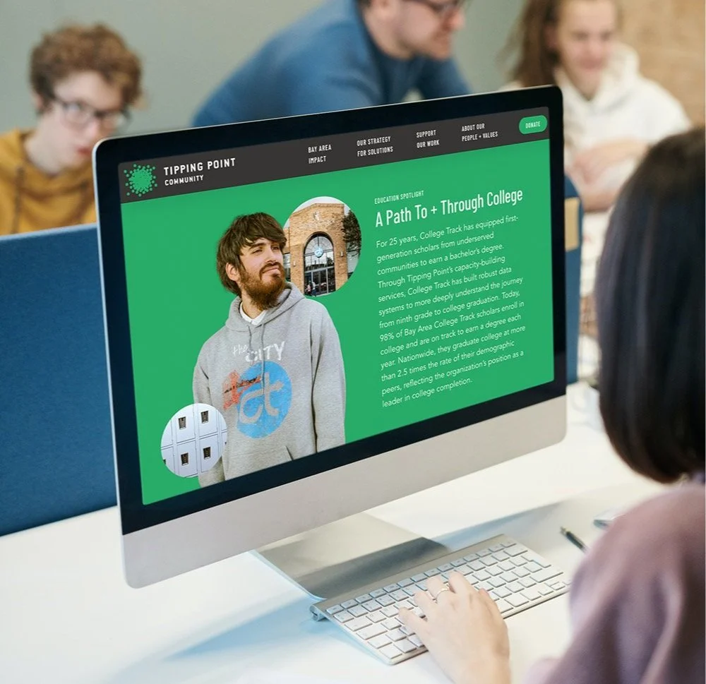
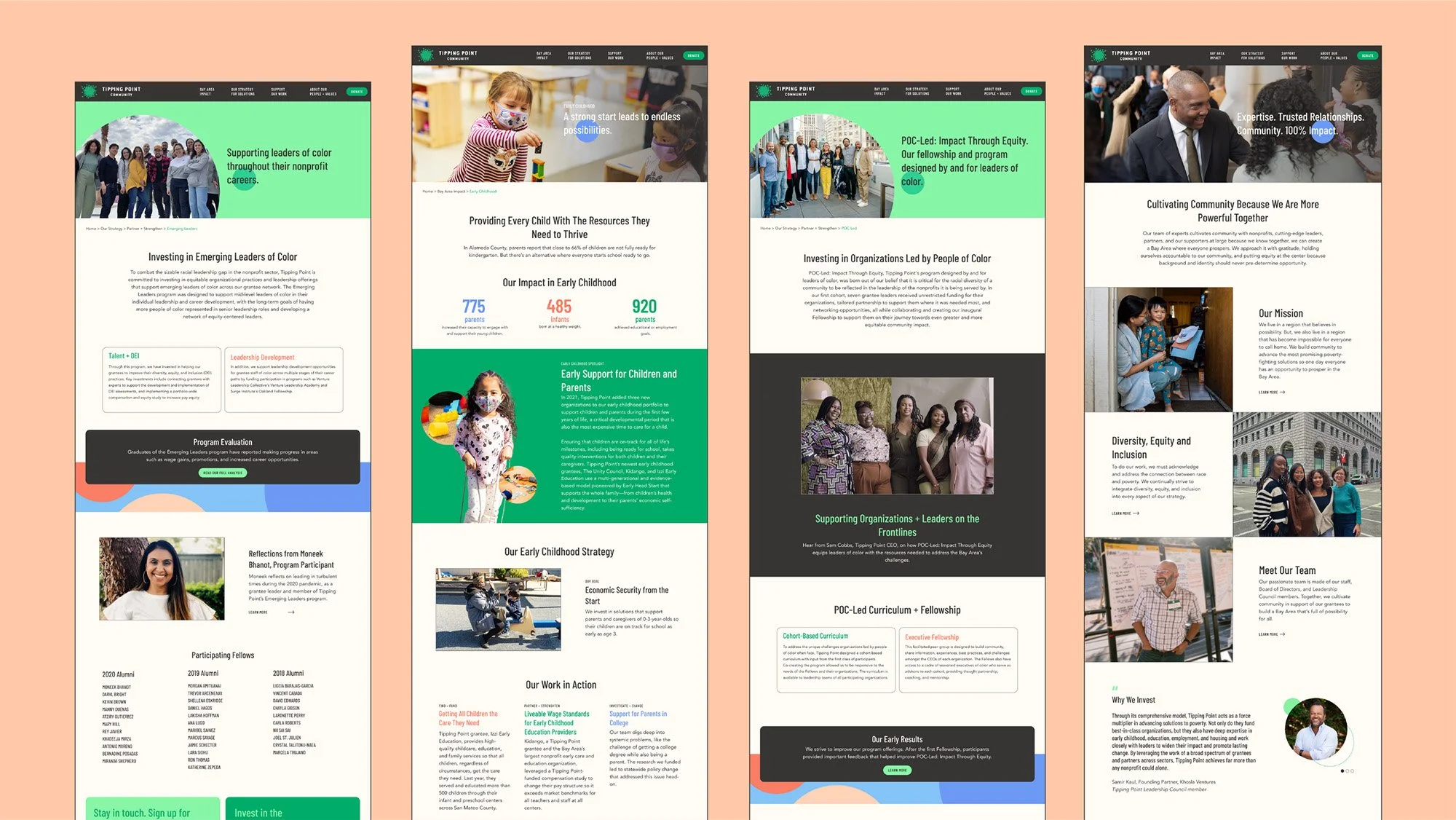
We created a site framework to build search equity in Tipping Point's critical pillars of poverty, homelessness, education, early childhood development, and job training so that interested searchers would find Tipping Point when looking for solutions in those areas. Our web work started with an in-depth audit of their site, understanding the functionality of what was working well, what needed revising, and where they wanted to go. The overall goals for the area that came out of our research were to create more front-door experiences for new visitors so they could quickly understand Tipping Point, their unique model, and their impact on solving poverty. They also wanted to highlight their people and values more, showing who on the team you'd be working with and adapting more of a concierge model to generate more trust.
After completing an extensive digital strategy plan, we translated that strategy into the wireframes for the website. The site architecture and layout of the pages needed to support a new program organization and set up opportunities for future content growth, including grantee pages, press releases, reports, and blogs. The content was categorized strategically to strengthen their SEO goals in ranking for Bay Area Impact in critical pillars of housing, education, job training, and early childhood development. We built up the most keyword equity in those pillars by having more of the website contain links to relevant content and callouts.
After wireframing, we built adaptive modules, each with a clear purpose. This setup was intentional so that when the client amended the site in the future, it could be easy for them to understand the back end. Because of the limited number of modules, there needed to be a good variety within the design so when they were sitting next to each other on the page, there would be lots of visual interest while keeping the content legible. It was fantastic to see their website's new look and feel take shape throughout the design process, weaving in the updated brand assets and creating a more welcoming experience that highlighted all the amazing things Tipping Point and their grantees do.
Creating treatments that tie back to the logo.
When developing graphic treatments, photography needed to be the hero. As an organization that serves people, it was critical to highlight the diverse community members that are a part of the Tipping Points ecosystem. Working with their excellent image library, we created various treatments combining photography and vector assets, all utilizing the theme of perfect circles to tie back to their logo.


Impact Report 2023
In addition to refreshing their brand and designing their website, we also created their annual impact report for the second year in a row. Their impact reports are a critical communication tool to demonstrate to donors how their contributions are being invested in creating a Bay Area where everyone can thrive. Transparency is vital for Tipping Point, so we designed scannable modules highlighting the impressive statistics over the past year. It's been great to partner with an organization tackling one of our communities most significant issues, and we're thrilled to support them in continuing the good fight.
WHAT WE DELIVERED.
Website Design
Website & SEO strategy
Site architecture
Navigation
Website design (UX/UI)
Copywriting
Photography treatments & assets
Brand Experience
Impact reports (content & digital design)
Newsletter
Social media templates
Data visualization
Research reports
Brand Identity
Research & analysis
Family of fonts
Color palette
Photography style
Photoshoot guide