YOSEMITE RIVERS ALLIANCE
UNITING CONSERVATION AND COMMUNITY
The Tuolumne River Trust has stood as a steadfast guardian of one of California’s most vital waterways and the lands that surround it for over forty years. But as their work expanded to restoring the Stanislaus and Merced rivers, forging partnerships, and rallying new communities of stewards, their name no longer reflected their reach or impact. They needed a brand that could capture not just where they work, but how they lead change, and inspire new supporters to join them within the next fundraising season.

A name with heart & bigger impact.
With a list of potential names already in hand, we conducted a Naming workshop to hone in on the top contenders while digging into the strategy of each option, and brought the Board along the journey to make the final decision. The new name— Yosemite Rivers Alliance — reflects their expanded geography and honors the multi-faceted approach needed to get the work done.
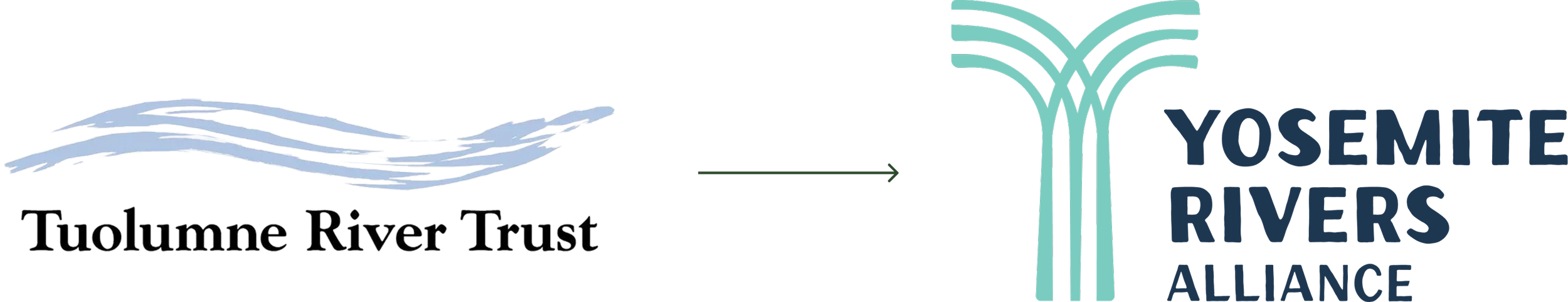
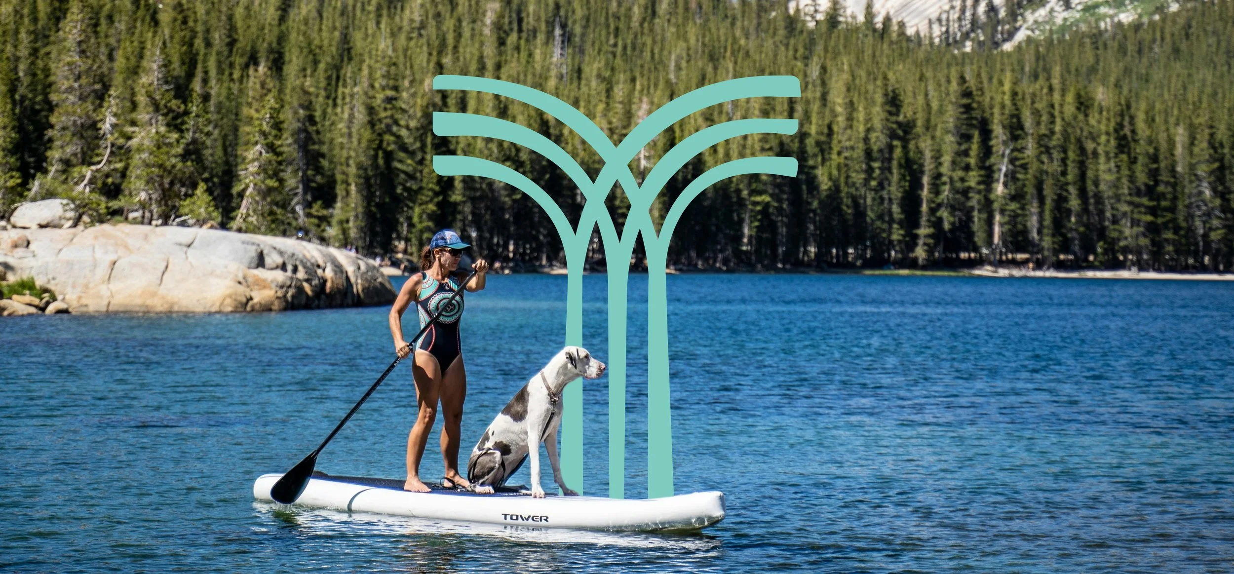
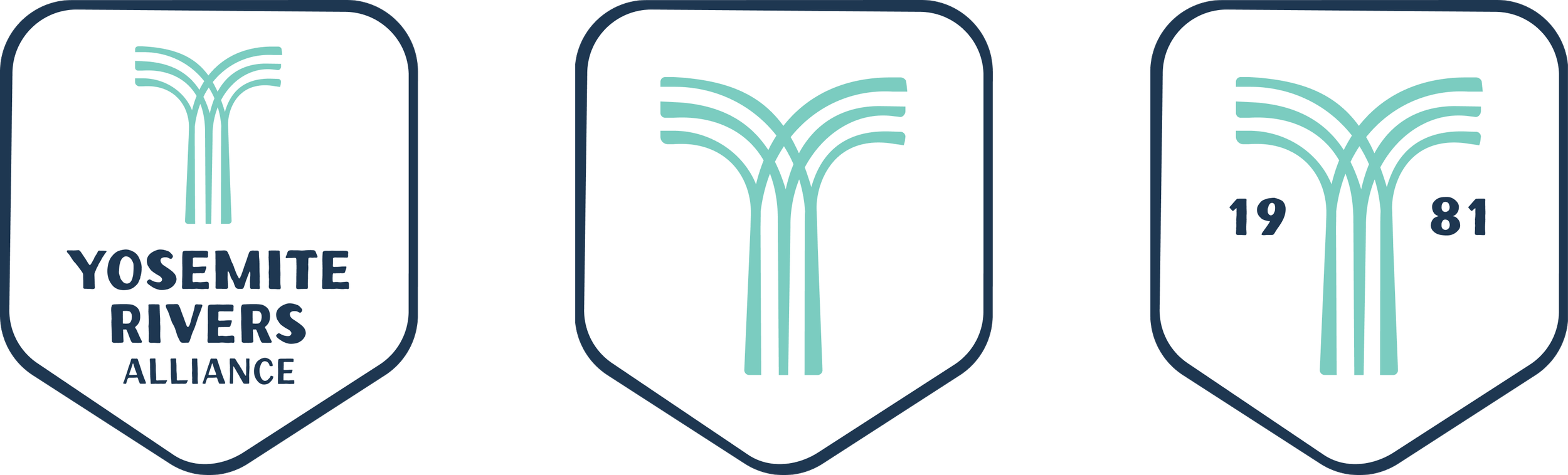
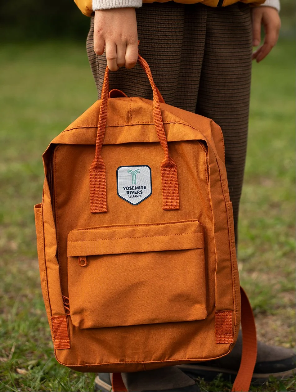
To embody the spirit of alliance, we designed a logo that shows the three rivers flowing together into one form. The font pays homage to their early conservationist heritage, while the color palette captures the grandeur of the Yosemite region’s landscapes.
We developed new messaging that ties together all facets of their work under one clear, compelling proposition: Uniting conservation and community for a resilient future.
Reframing their impact story in a bigger, bolder way—showing not just what they do, but why it matters—they can connect with new audiences.
They now have a brand that communicates the breadth of their reach, the strength of their alliances, and the urgency of their mission, elevating them into the next era of conservation.


WHAT WE DELIVERED.
Brand Identity
Logo
Family of fonts
Color palette
Copy style
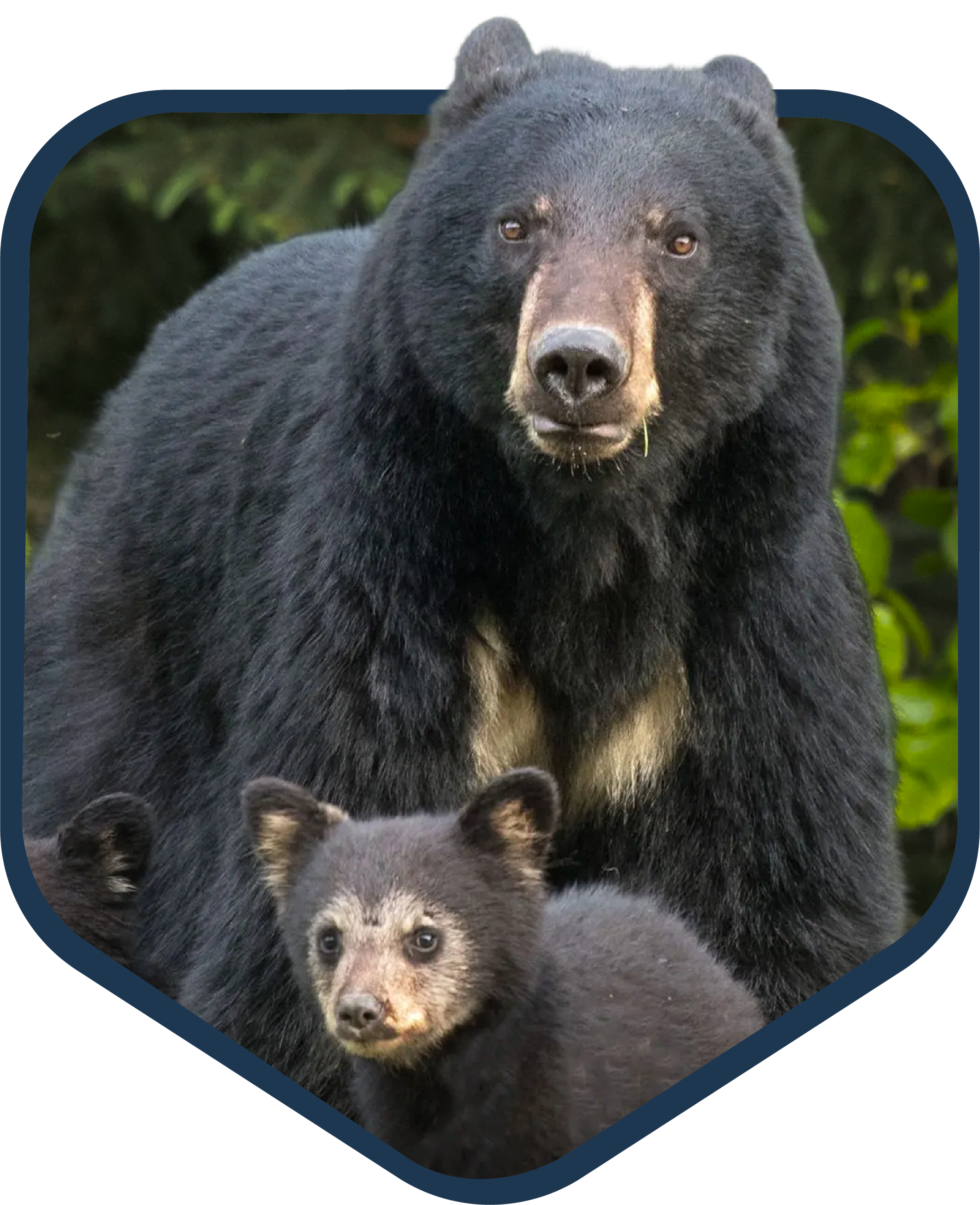
Photography style
Style guide
Brand Strategy
Research & analysis
Core essence
Personality
Tone of voice
Brand Voice
Naming
Descriptor
Elevator pitch
Purpose statement
Key messages